RAPTORS LOGO DESIGN EVOLUTION - 1995
Original Raptors Logo
The Toronto Raptors entered the NBA with a logo that featured a red, cartoonish velociraptor dribbling a basketball. While the initial logo was met with mixed reviews, it captured the essence of the team's identity as a fierce competitor.
Jurassic Park had dominated theatres just two years prior in 1993 and dino-mania was still sweeping the nation. The brand identity made a lot of sense for this reason. Children and teenagers (who would later grow up to be die-hard fans) would connect with this brand perhaps more than the adults at the time.
RAPTORS LOGO DESIGN EVOLUTION - 1995
Alternative Raptors Logos
In 1998, the Raptors landed Vince Carter, the most iconic player to sport the dino logo. Not only was he crowned Rookie of the Year and slam dunk champion. He also took the Raptors to their first playoff spot in 2000 and brought home a gold medal at the Olympics.
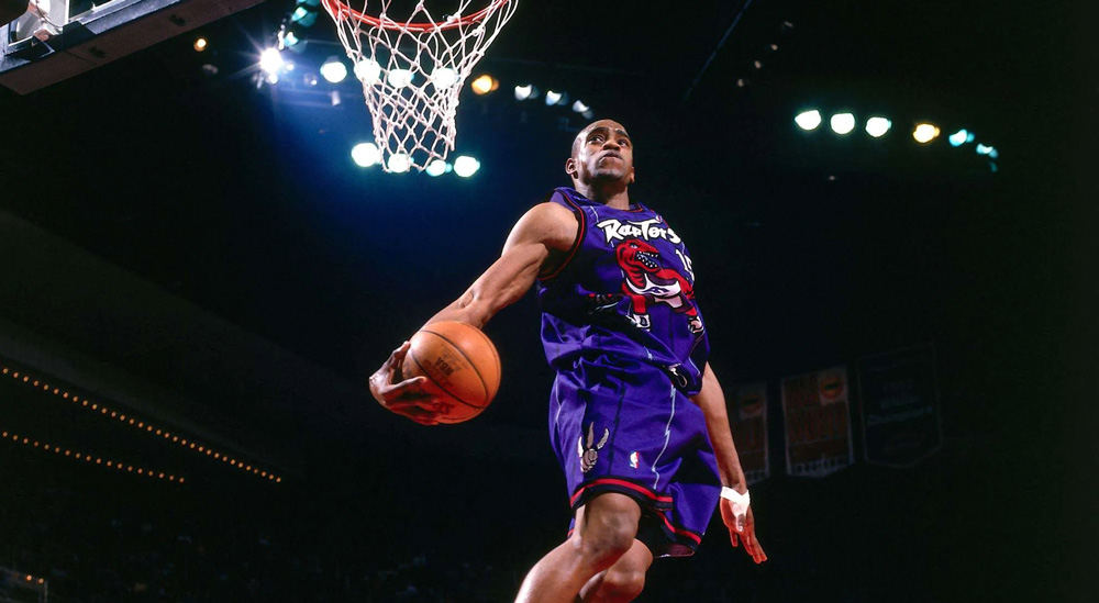
Vince probably had no idea at the time how he contributed to the dino's fame as he was flying toward the rim each night. Today his dino jersey is a fan favorite in Toronto.
However, it is no surprise that the franchise began to experiment with alternative logos and uniforms once Vince arrived. The uniforms lost the Dino logo and would typically feature just the "Toronto" or "Raptors".
The Toronto Raptors have had many alternative logos. Some of the more prominent examples are these two alternative dino logos and early ball, and claw logo that would often appear as a supporting element to the primary dino logo.
RAPTORS LOGO DESIGN EVOLUTION - 2008
Raptors Logo Transition
In the 2008 season, the Raptors began to distance themselves completely from the purple color. They removed it from their primary dino logo and went with just black and red. As well at this time, they experimented more with alternative logos from their growing collection. For example, the ball and claw combination seemed to appear more often.
RAPTORS LOGO DESIGN EVOLUTION - 2015
Raptors Logo Rebrand
As the team entered a new phase, the Toronto Raptors introduced a fresh logo in 2015. It featured a sleeker and more stylized basketball with a claw mark tearing into the ball. This design aimed to modernize the team's visual identity, keeping pace with the evolving NBA landscape. The logo retained the team's iconic red color and incorporated black and silver to create a more dynamic and sophisticated look. This new logo could also be reproduced well in any size. Perfect for small digital icons.
RAPTORS LOGO DESIGN EVOLUTION - 2020
Simplified Raptors Logo
The 2015 Logo Design has remained largely unchanged to this day, undergoing only minor adjustments like the recent 2020 alteration that eliminated the grey color from the ball icon. The shift in focus to the ball itself represents a natural and logical evolution in the design.
RAPTORS MARKETING CAMPAIGN
“We The North” Campaign
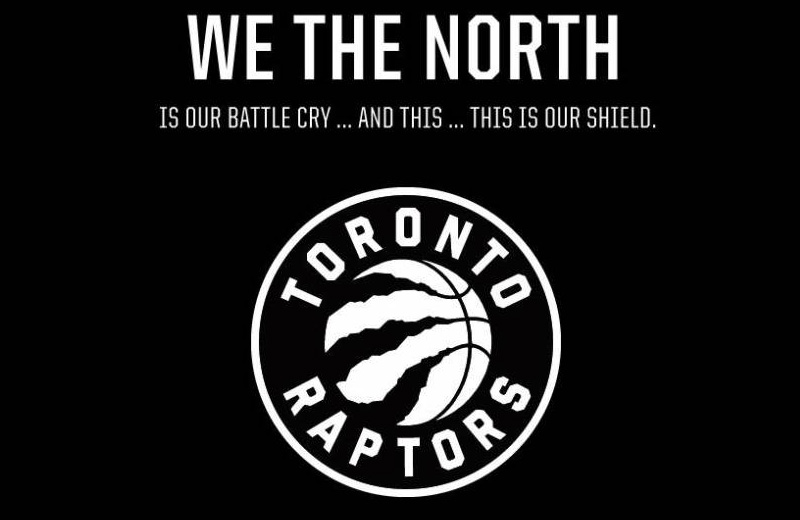
In 2015, the Raptors unveiled their current logo alongside the introduction of the "We The North" campaign. The logo maintained the fierce and powerful idea of a raptor but with a more streamlined and menacing appearance. The dinosaur's claw mark is embedded across a basketball.
The "We The North" slogan represents the Raptors' connection to the entire nation of Canada, emphasizing their status as the country's sole NBA franchise. The timing of the release and the wildly popular Game of Thrones series that utilized the same slogan was brilliant timing.
RAPTORS LOGO DESIGN
Symbolism and Impact
The Toronto Raptors logo has become an integral part of the team's identity and has successfully connected with fans across Canada and beyond. The evolution of the logo reflects the team's journey and growth in the NBA. Each design iteration has brought its own unique symbolism, capturing the essence of the team's spirit, competitive nature, and commitment to excellence.
Moreover, the logo has played a significant role in creating a strong brand image for the Raptors. It has been featured on merchandise, court designs, and promotional material, contributing to the team's commercial success and recognition. The logo has also become a rallying symbol for fans, creating a sense of unity and pride among the Raptors' passionate supporters.
The Toronto Raptors logo has undergone a remarkable evolution since the team's inception, capturing the essence of their competitive spirit and reflecting their growth in the NBA.
From the original cartoonish raptor to the sleek and powerful design seen today, each logo has played a vital role in shaping the team's brand identity.
The symbolism and impact of the logo extend far beyond its visual appeal, forging a strong connection with fans and establishing the Toronto Raptors as an iconic basketball brand.

RAPTORS OVO LOGO
Raptors and OVO Logo Collaboration
Following the introduction of the revamped rebrand and logo design, Toronto's own Drake has become intricately linked with the Raptors' brand identity, unleashing numerous design iterations. Among these, the collection of Gold logo designs stands out, frequently accompanied by his acclaimed OVO brand. This collaboration has proven fruitful for the Raptors, Drake, and the city of Toronto.
SOURCES AND REFERENCES
interested in more links
theglobeandmail.com // sidlee.com // sportslogos.net // nba.com/raptors // nba.nbcsports.com // sportsnet.ca
